Close Menu
InclusiFund
    What's Hot

    Netanyahu Considering Crypto Plan to Dodge Banking Sanctions on Israel

    October 23, 2026

    Bosun Tijani, Samuel Nartey George and other African candidates to watch

    October 23, 2026

    Which Work Best? — Smashing Magazine

    October 23, 2026
    Facebook X (Twitter) Instagram
    InclusiFund
    Facebook X (Twitter) Instagram
    • Home
    • Daily Brief
    • Dealflow Dashboard
    • Sectors
      • Agritech
      • Climate Tech
      • Fintech
      • Healthtech
      • Logistics
      • Mobility
      • SaaS / Enterprise
    • Tools
    • Reports
    • Opinion
    • Services
      • For Investors
      • For Founders
    • About Us
    • More
      • Disclaimer
      • Advertise With Us
      • Newsletter
      • Work With Us
      • Terms and Conditions
      • Privacy Policy
      • Contact Us
      • About Us
    InclusiFund
    Home»Tools»Which Work Best? — Smashing Magazine
    Tools

    Which Work Best? — Smashing Magazine

    ElanBy ElanOctober 23, 2026No Comments5 Mins Read
    Facebook Twitter Pinterest LinkedIn Tumblr Reddit WhatsApp Email
    Which Work Best? — Smashing Magazine
    Share
    Facebook Twitter LinkedIn Pinterest WhatsApp Email

    A closer look at accordion icons, why split menus are harmful, and why it’s better not to have icons and text labels link to different actions. Plus, why the caret is the safest icon choice. You’ll find more useful guides and online workshops here on Smashing Magazine, so make sure to browse and explore.

    So what icon is the most reliable to show expansion and collapsing for accordions? Is there really any noticeable difference between carets, chevrons, arrows, and triangles?

    Well, research shows that there is some difference indeed. But what’s more interesting is that split menus are harmful, why it’s better to not have icons and text labels link to different actions, and why the caret is the safest icon choice. Let’s dive in!

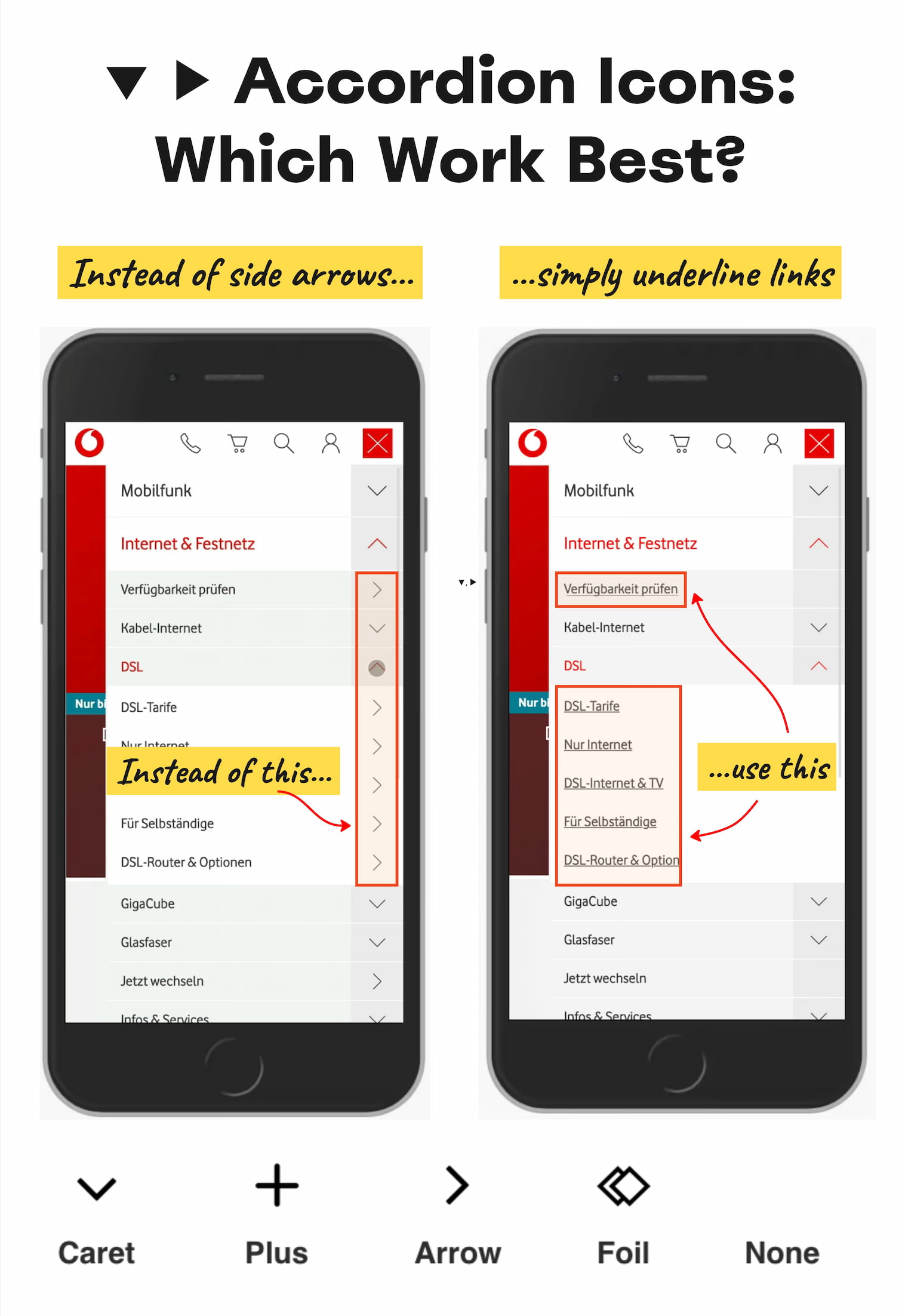
    Accordion icon study from NN/g: a full breakdown of which icons (caret, arrow, plus, none) are most effective at signaling accordion behaviour vs. page navigation
    Research from NN/g on which accordion icons work and which create confusion. If it’s a link, underline it. If it opens an accordion, use a caret. It’s that simple. (Large preview)

    No Icon = Opening The Page

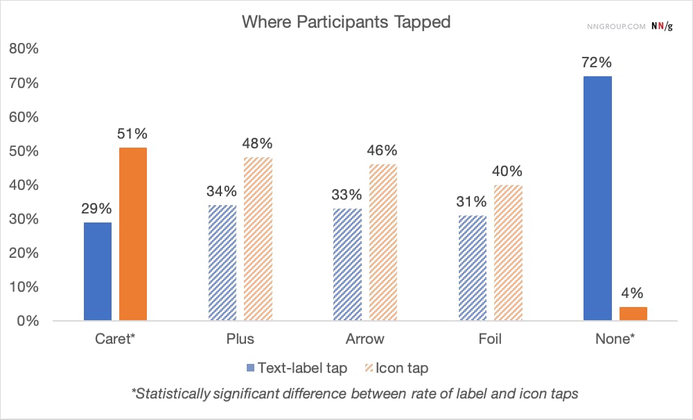
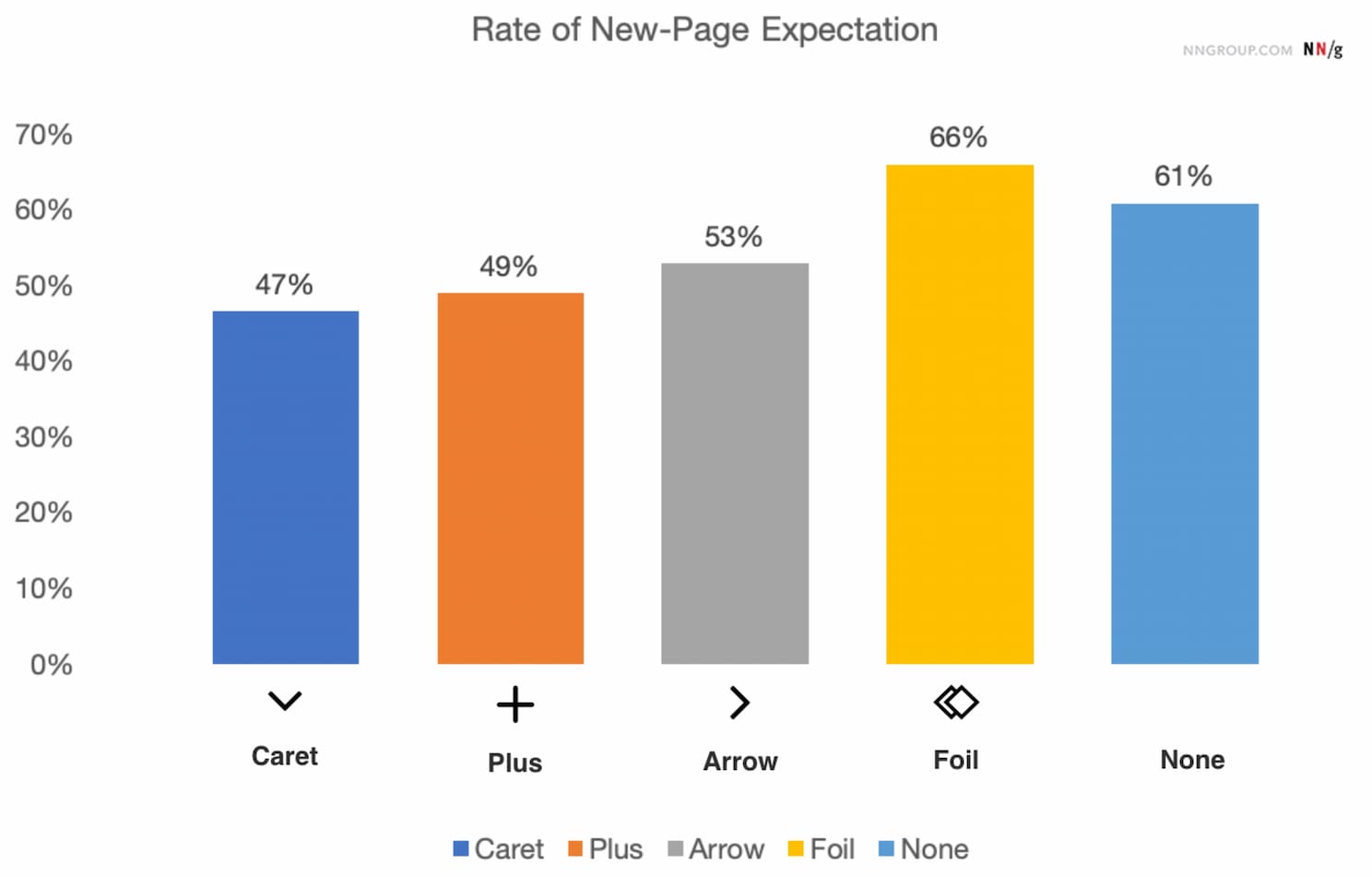
    The findings aren’t very surprising: without any icon in use, users expect that tapping on the menu item would take them directly to a new page. Users often struggle with custom icons as they don’t clearly signal that they’ll open an accordion. And people tend to tap fairly equally on the icon and on the label for most icons.
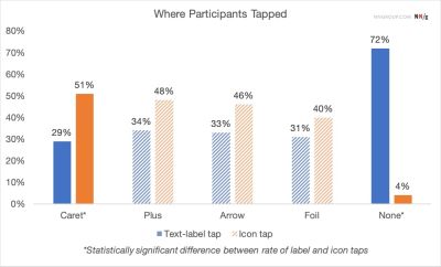
    Accordion icon study results showing user expectations by icon type — no icon, arrow, caret, and plus — and how each affects whether users expect a page navigation or an accordion opening
    Participants were equally likely to tap on either the text label or the icon, except for the caret, where people tapped more on the icon. From the NN/g study on accordion icons. (Large preview)

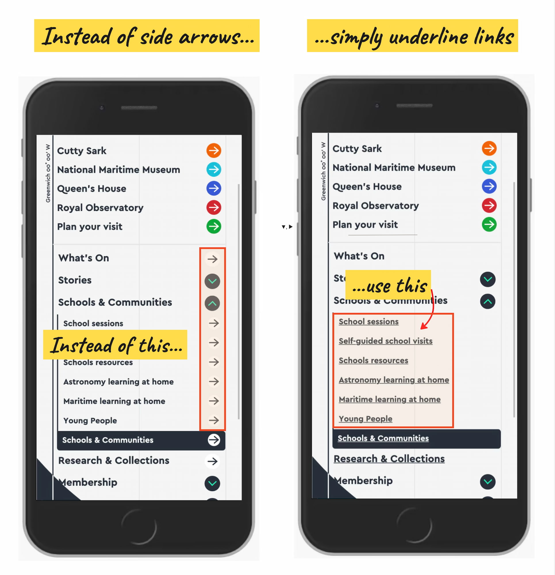
    Many designs (like the one below) tend to slightly overcomplicate things by adding arrows and carets pointing everywhere, depending on the state of the accordion. But typically we don’t need to use an arrow to indicate a link to the category.

    Additional findings from the NN/g accordion icon study showing icon-tapping vs. label-tapping behaviour across different icon types and accordion states
    People tend to tap fairly equally on the icon and on the label, which means the icon choice affects the whole hit area, not just the visual signal. From the NN/g study on accordion icons. (Large preview)

    The rule of thumb is very simple: if it’s a link, the easiest and most effective way is to simply underline it — without any arrow, caret, or other icon. Perhaps it’s not particularly exciting, but it works flawlessly every single time.

    Confusing Behavior With Arrows ▶ and Split Buttons

    Using a right-facing arrow icon ▶ isn’t associated with an expectation of going directly to a new page. And having the same icon pointing down ▼ doesn’t necessarily imply that an accordion is going to open on tap/click.

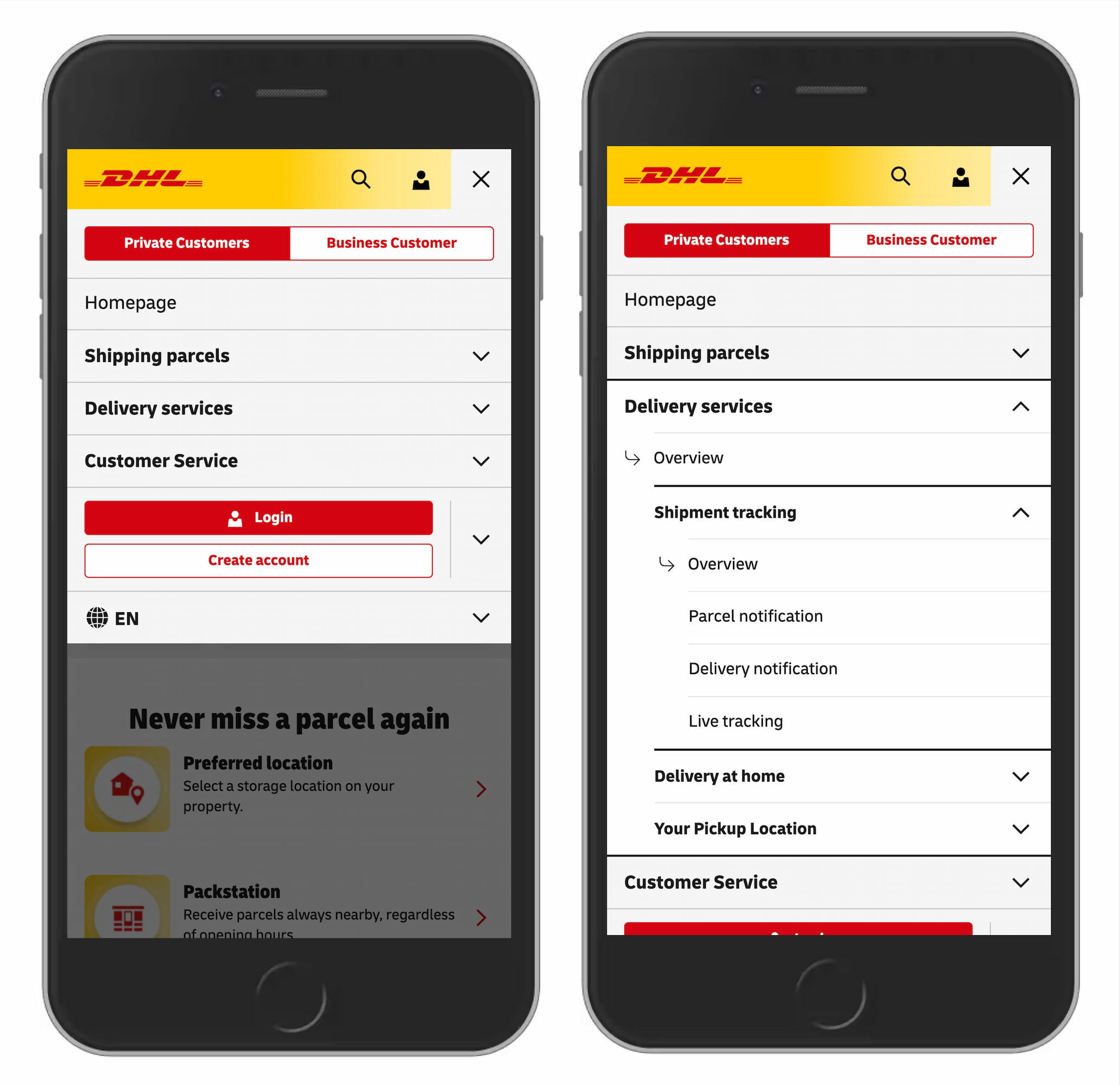
    It’s a good idea to avoid split buttons for accordions — where the text label links directly to a page, but the icon opens the accordion. Instead, it’s much more reliable to allow users to tap on a main category and expose the menu; and to access the category page, we add a link to it inside the menu.
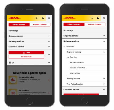
    DHL navigation showing accordion icon usage in a real-world e-commerce context: an example of how a major shipping and logistics brand applies accordion signifiers in its menu design
    An accordion navigation from DHL: no unnecessary arrows, no split menus, with “Overview” links in each section. (Image source: DHL.de) (Large preview)

    Plus +/− and Arrows ↓/↑ Are Understood, But Can Be Misunderstood

    For accordions, we typically use +/− or arrows ↓/↑ to signal expanded and collapsed states, and typically it works well. However, both have many different interpretations. Plus + can mean anything from saving for later to adding to cart to zooming in, and can be particularly confusing for multi-level navigation, with many levels open at the same time.
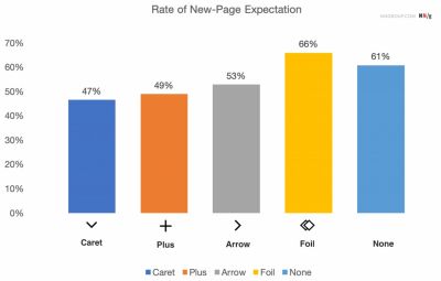
    Split button accordion pattern showing the problem of having a text label link to a page while the icon opens the accordion — a confusing interaction that fails usability tests
    What users actually expect: more people expect a new page when clicking on an arrow, but even more when no icon is provided at all. From the NN/g study on accordion icons. (Large preview)

    Arrows ↓/↑ can mean scrolling or sliding or finding the next match, but also a jump to a particular portion of a page. Both plus and arrows are well-understood and work, but depending on the design, can be confusing — mostly because they are overloaded.

    Wrapping Up

    The safe choice is to use the caret/triangle pointing down ▼ by default, and change it to a caret pointing up or a caret pointing sideways ▶ on interaction. If you need an alternative, then +/- typically work well, too.

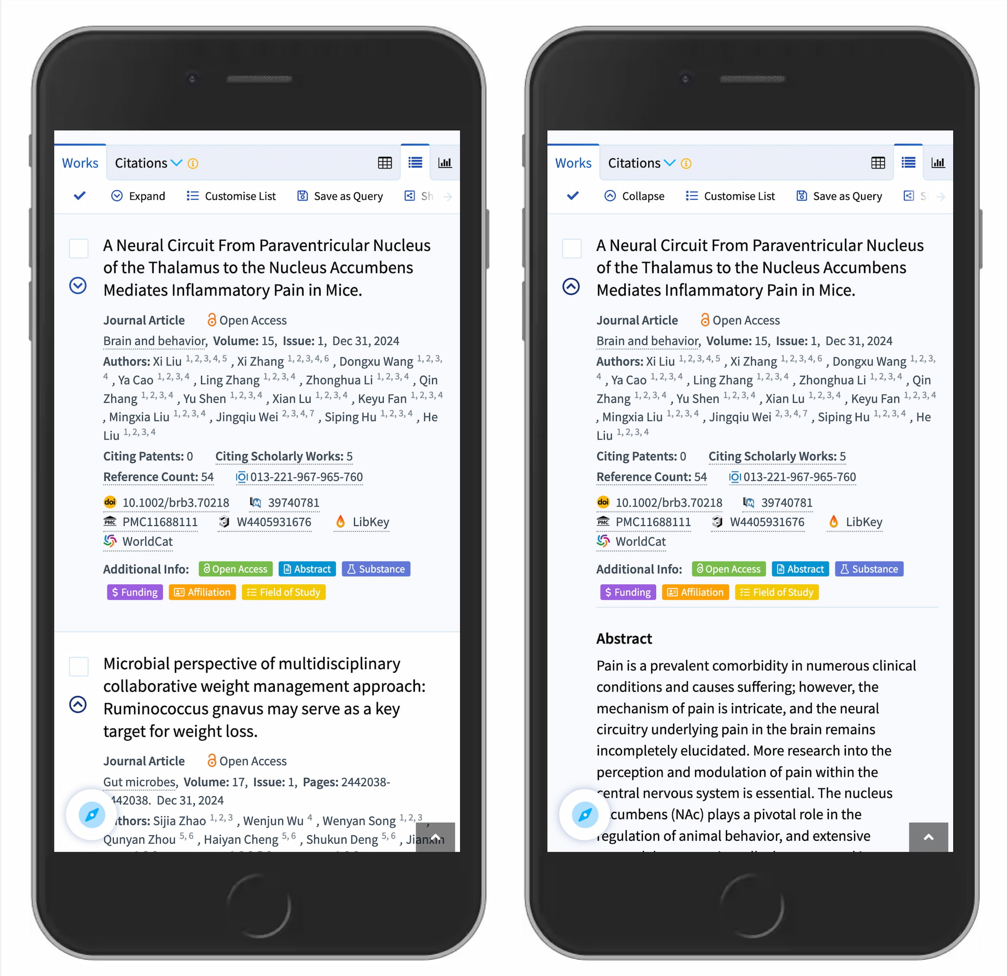
    Lens.org scholarly search on mobile showing accordion expand/collapse — left phone shows a collapsed result list with a caret-down icon, right shows the same item expanded with the abstract visible and a caret-up icon
    The caret working well for search results expansion. Lens.org uses a caret-down to indicate collapsible items. (Large preview)

    But we certainly don’t need any further icons or arrows to indicate where the links go. The same goes for split menus, which often produce more mistakes than help. Instead, we have one button or dropdown that does exactly one thing — shows all options and allows users to drill down.

    And if you need a direct link, we link the title directly to the page and underline it. More often than not, simpler is better.

    Editor’s Note

    We hope you’ll find these wonderful projects useful — put together by wonderful creators. A friendly shout-out to everyone sharing their work with folks to use and learn from! That’s one of the reasons why we truly love the web and people building and designing it. 💚

    At Smashing, we love the web. That’s why we publish articles and books, run workshops and events around everything web. We love seeing what we all can do to make the web more accessible and usable. We also love organizing and attending online events — with friendly discounts for large groups (5+ attendees) and schools and students. Interested? Just send us an email and we’ll sort it out!

    Smashing Editorial
    (yk)
    Magazine Smashing Work
    Elan
    • Website

    Related Posts

    Nintendo Switch 2 jailbreak discovery could open the door to a world of mods

    October 22, 2026

    Chrome Adds Suspicious Site Warnings and ClickFix Clipboard Protection to Enhanced Protection

    October 21, 2026

    iPhones lasts longer than you think — here’s how to know when to upgrade

    October 20, 2026
    Leave A Reply Cancel Reply

    Economy News
    Crypto

    Netanyahu Considering Crypto Plan to Dodge Banking Sanctions on Israel

    By ElanOctober 23, 20260

    In brief Netanyahu said on Israeli television that he has asked for a plan to…

    Bosun Tijani, Samuel Nartey George and other African candidates to watch

    October 23, 2026

    Which Work Best? — Smashing Magazine

    October 23, 2026
    Top Trending
    Crypto

    Netanyahu Considering Crypto Plan to Dodge Banking Sanctions on Israel

    By ElanOctober 23, 20260

    In brief Netanyahu said on Israeli television that he has asked for…

    Tech

    Bosun Tijani, Samuel Nartey George and other African candidates to watch

    By ElanOctober 23, 20260

    Every time you stream a video, make a cross-border payment, or register…

    Tools

    Which Work Best? — Smashing Magazine

    By ElanOctober 23, 20260

    A closer look at accordion icons, why split menus are harmful, and…

    Your source for comprehensive insights on Africa’s private credit markets, InclusiFund synthesizes deal pipelines, repayment patterns, collateral trends, and sector-level signals to guide investors in underwriting and structuring credit in emerging African markets.

    We're social. Connect with us:

    our Categories
    • Work With Us
    • Advertise With Us
    • Contact Us
    • Disclaimer
    • Privacy Policy
    • Terms and Conditions

    Subscribe to Updates

    Get the latest creative news from FooBar about art, design and business.

    Facebook X (Twitter) Instagram Pinterest
    • Work With Us
    • Advertise With Us
    • Contact Us
    • Disclaimer
    • Privacy Policy
    • Terms and Conditions
    © 2025 Inclusifund. All Rights Reserved.

    Type above and press Enter to search. Press Esc to cancel.